BUILDING BRAND STICKINESS: Prospect awareness determines brand creativity
The most sought-after real estate is in the mind of your audience.
Brand stickiness stakes a claim with your audience and creates loyal, raving fans of your business.
Before that can happen, you must understand their brand awareness level.
Branding is more than slapping your logo on everything and calling it "branding."
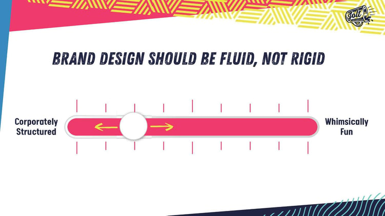
It's about letting your brand move, sway, and bend based on where your prospects are.
A brand that's too rigid misses creative opportunities and ignores its audience.
When your brand is fluid, you can break free from constraints.
At Snappy Kraken, we build our mantra around "Corporately Structured and Whimsically Fun."
Let's look at how we design our brand based on prospect awareness.
SECTION 1: Cold Prospects (Know nothing about us)
Cold prospects know nothing about Snappy Kraken.
They don't care about us.
We have to give them a reason to care.
Look at this set of social posts.
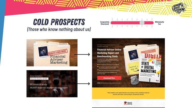
Notice how we don’t use our logo, brand colors, or fonts.
Why?
They care about the topic that interests them, not about who it’s from. Not yet.
When they click through to the landing page, that will be the first time they’re being introduced to the brand.
Subtle use of our logo and colors.
What we've done is link our brand with something they care about.
That's the first step in building brand stickiness.
SECTION 2: Warm Prospects (Heard of us but still unsure)
After prospects warm up to the brand, they have a basic idea of who we are.
They may end up visiting our website.
When they do, they’re introduced to more of the brand.
It's a bit more corporate, but there are more elements of whimsically fun going on.
Once they scroll through from the top, they'll see those whimsical elements become more minimal, giving them a sense of familiarity with the brand because we understand that our offer's creative differences could turn off advisors.
It's not something they're used to seeing in the industry.
This is how we use design to help them feel more comfortable.
SECTION 3: The Role of Education
Knowing who your audience is, is key to priming them.
Take this image from The Office as an example.
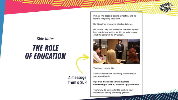
The Office fans will remember this scene.
Michael’s holding a meeting, but no one is paying attention to him.
They're fixated on the TV behind him, watching the logo bounce around the screen.
If your audience has something more entertaining to look at, they won't pay attention to you.
This, when combining your content with visually compelling graphics, keeps your audience engaged.
You don't want them to determine what they think your difference is.
You want to tell them what the difference is.
SECTION 4: Hot Prospects (Educated and fully accepting of the brand)
Now that our prospects are primed and hot, we can pull out all the stops and lean hard on the whimsically fun version of the brand.
Check out our exclusive Snappy Kraken Member Community Email.
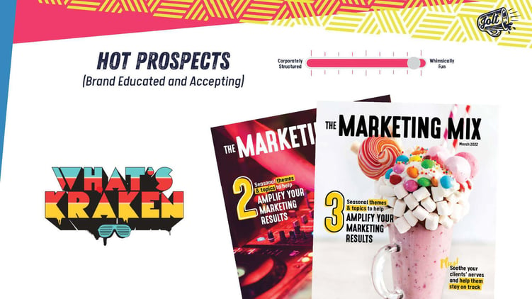
(90s underground hip-hop was the main inspiration for the design. Snappy Kraken's Marketing Mix that's built like an editorial magazine.)
Imagine if we put that in front of a cold prospect who's unsure.
They'd likely be turned off, but since we've taken them through the relationship funnel, they're more accepting and brand aware.
At this stage, they understand the difference between our offer and understand why creativity is necessary.
No stock photos here.
The imagery used awakens the reader and grabs their attention.
It's a much more engaging piece of content that's easy to consume and gets you excited to jump in.
CONCLUSION: The prospect stage in the journey influences your design needs.
It all starts with understanding your audience and their relationship with your brand.
To do that, don't keep your brand in a box.
Having a fluid brand jumpstarts that relationship from "I don't know you" to "I'm going to tell everyone about you."
Not only is design your friend, but it's your first line of defense when staking that claim in your audience's mind.
Book A Demo Today
Discover how Snappy Kraken helps advisors grow with a powerful marketing system
Request a demo


